Website Not Mobile-friendly?
You Can Kiss Your Google Rankings Goodbye…

July 2018 Google rolled out their Mobile First Index algorithm change. Basically, it means Google is going to rank results according to the mobile version of your page / site. Prior to this, they were ranking according to the desktop version of your page / site.
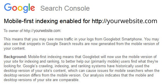
This is the notice that Google sent out July 3, 2018:
What this means? If your site is not optimized for mobile, your Google rankings may drop or maybe even disappear – depending on how bad your page / site is on mobile.
Google is always centered around optimizing the user experience. And with more and more people using Google and visiting websites from mobile devices, it is obvious that Google will lean towards the needs of these mobile users more and more. Just like you, Google doesn’t like it if mobile visitors to your website…
- …have to swipe side to side (horizontally) to read the page
- …have to zoom in in to be able to read the tiny fonts on the page
- …have to wait too long for slow-loading pages
- …can’t use your website because it has a big Flash component (most mobile browsers don’t support Flash unless you download specific apps for it)
How To Be Ready For Mobile-First What your website needs is:
- A “responsive” design (so your website adjusts to different screen sizes), or
- A dedicated mobile version – probably with less content than your desktop site
- Fast loading speed (this is a huge rank factor in Google now).
- Easy to use on mobile
- Make sure that pop-ups and ads don’t take up too much real estate on the mobile screen
